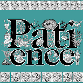
I'll show you respect! True to my promise, here is "Respect," the final cornerstone of that societal edifice we call Marriage. Don't know why I didn't include it in my original four, it's much more apropos than "Wisdom," don't you think?
There's really no rhyme or reason to how I choose the pieces of clipart to use (beyond compatibility of style.) There's Chinese cranes juxtaposed with nouveau florals, punctuated by 19th-century typographic ornaments. The text has to remain readable and can't be obscured too much, though I do definitely appreciate a cluttered, Victorian aesthetic. (You should see my house, ha ha.)
Tomorrow I'm going to share some of the vintage valentines (circa late 50s/early 1960s) that I found on my recent trip to my childhood home in Southern California. Some great stuff, and their copyrights have expired!! Stay tuned!
The story of a little shop on CafePress, and one woman's fight to save the world, one mousepad at a time.
Showing posts with label typographic. Show all posts
Showing posts with label typographic. Show all posts
Friday, June 18, 2010
Sunday, April 4, 2010
Ah, hello.
I have been remiss. I'm finding that I treat blogging as I used to treat writing in my diary at age 13 -- it's a habit I resist getting into.
It's not that I haven't been busy, or that I haven't "done" anything; I actually have. I've created a set of 4 "Qualities That Are Useful If You're Married" designs, heavy on the Victorian typographic ornaments, with the express intention of using them for wedding presents I need to send this year. They're beautiful, if I may express an opinion.
It all started with this graphic:
which I found somewhere on the web but can't credit. It was from the site of a stationery designer. If you have info, I'll credit it.
Anyway, I took the look of the first and went crazy with it, initially on a monogram for me:
I delved into my cache of typographic ornaments and ornamented it to within an inch of its life.
Flush with success, I asked my husband for something to embellish. "Do a logo for my band," he said. So I created a Tres Gone logo along the same lines, to be seen on their Facebook page here.
And then I added color: (which one do you like best?)
Then came "Yin/Yang," which seemed like a logical next step in my ornamenting frenzy. It's all about balance... heavily ornamented Yin is complemented by an equal but opposite Yang.
Then came "Love," the next in my hippie archive of my imagination. The theme of my shop is what makes people feel good, after all, and Love would have to be Number One on that list.
These are all churning out at a high rate, you understand. No sooner have I finished one than I'm looking for something else to embellish.
Aha! It came to me in a flash. "Patience." The counterpart to Love. This one is set in upper-lower case, for some reason. And it came out in color.
After that, Wisdom and Forgiveness seemed the logical next steps. I had received two wedding invitations and my mind was turning toward wedding gifts.
And there I have my wedding gifts. Mugs, decorated with the qualities that make for a happy marriage. Available here at Feelgood Graphix on CafePress.
Labels:
CafePress.com,
colorizing,
Facebook,
Forgiveness,
hippie,
Love,
monogram,
ornamental,
ornaments,
Patience,
Tres Gone,
typographic,
values,
Wisdom,
Yin Yang
Subscribe to:
Posts (Atom)


